Sarta Residence Rebuild
- Alyssa Wieske
- May 15, 2023
- 2 min read

Updated: Dec 18, 2024

This project started as an out dated bungalow. Our clients found an old home, with a good foot print, in a great neighbourhood and asked us to come in to redesign it. To check off all the items on their wishlist, we took it back down to the foundation and built it as a two storey home. Our team took care of the full design, development of permit drawings and application, and managed the construction. (You can learn more about our process and how to work with us here!) It was such a great process to be part of, and we are so thankful to our clients for trusting us with their home!

These are the kind of houses that catch my eye. Everything looking to be updated with so much potential!


Everything was taken back to the original foundation and built back up on the existing footprint.

One of the biggest requests from the homeowner was a white home with black windows. We mixed in some shakes to the front peak to add in some texture and added in a small black bump out to make room for a tub in the ensuite.


Inside we were able to incorporate vaulted ceilings into the main living space and in the primary bedroom. It made the spaces feel so much larger and made for a really beautiful ceiling feature. We had it covered in shiplap with shallow beams, and painted it a natural cream to match the trim and baseboards.


The kitchen faces into the backyard with two large windows on either side of the range, and patio doors that lead onto a covered porch.

The White Oak shiplap island compliments the ceiling, and a panel ready fridge made for a seamless design.


The laundry room is one of my favourite rooms in the house. We used an old reclaimed concrete sink, and made a pine base for it to sit on. On the wall behind we included a shiplap detail with a small shelf to hold detergents. On the floor we had a brick tile installed in a herringbone pattern. All really neutral finishes that feel collected and timeless.

The ensuite bathroom was designed to reflect the exterior finishes. The use of whites and creams with contrasting accents of black gave the space a dramatic and elegant feel. In the shower we had 12×24 charcoal tile installed as a boarder along the base with subway tiles above. It was an inexpensive way to add a really beautiful detail. On the floor throughout we used a small marble herringbone which kept the space feeling light, and introduced some pattern and texture.


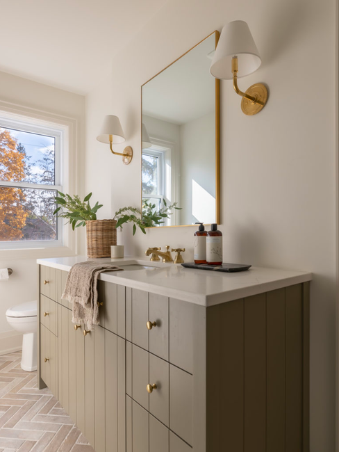
The olive green shiplap vanity in the second floor bathroom checks all the boxes! I love the playful detail it adds to this room. We used the same large format tile along the base of the shower as in the ensuite, but used a lighter tile. I love how it mixes with the brass details throughout the room and the brick flooring.


Thank you for reading, and let me know if you have any questions in the comments!
– Alyssa


keo nha cai hôm trước mình lướt thử vì thấy mấy ông bạn hay nói, kiểu tò mò xem trang này trình bày ra sao thôi. Mình không rành mấy thuật ngữ nên chủ yếu nhìn cách họ để thông tin có dễ nắm không. Thấy ổn ở chỗ bảng tỷ lệ để dạng cột nhìn khá “đã”, odds với mức chấp tài xỉu nằm rõ ràng nên scan nhanh vẫn hiểu đại khái. Có cái hay là số liệu cập nhật liên tục theo thời gian thực, mình để tab đó một lúc quay lại đã thấy con số nhảy khác rồi. Mà giao diện không bị nhồi chữ, lướt xuống vẫn dễ chịu, không phải bấm qua lại…
bongdalu808 hôm bữa mình rảnh nên click vào coi thử cho biết thôi, kiểu xem họ bày thông tin ra sao chứ không có ngồi đọc sâu. Vừa mở lên là thấy ngay mấy khung tỷ số trực tuyến với lịch thi đấu đặt khá rõ ràng, nhìn phát nắm được chứ không bị rối chữ. Mình thích cái cảm giác mọi thứ chia thành từng block, lướt xuống cũng dễ theo dõi. Có thêm cái thanh chọn múi giờ GMT kéo qua lại được, ai hay xem trận theo giờ khác chắc đỡ phải tự quy đổi. Mình chỉ nghía vài phút mà quen cách nhìn luôn, vì phần tỷ số và lịch nằm ngay trên trang, kèm thanh…
kèo nhà cái 5 hôm bữa mình lướt thử vì thấy có người share, chủ yếu xem cách họ bày nội dung chứ không định đọc sâu. Vào trang cái là thấy phần nhận định soi kèo đặt ngay phía trên nên tìm trận khá nhanh, tiêu đề nhìn phát biết luôn đang nói tới kèo nào. Mình có để ý bài Stjarnan vs Valur (02h15 ngày 18 07) được làm gọn, đoạn mở đầu vừa đủ để nắm bối cảnh chứ không dài dòng. Lướt xuống cũng không bị rối mắt, kiểu mỗi bài nằm trong khối riêng, khoảng cách chữ ổn nên đọc lướt vẫn dễ. Nói chung cảm giác trang này ưu tiên cho người xem nhanh,…
Hi! So gorgeous. Are the wall colors Simply White?